
Autumn - The Cinematic Season
Colour palettes, florals & stationery for an Autumn wedding — including the aesthetic directions and 2026 trends defining the most beautiful September, October and November celebrations.
SEPTEMBER | OCTOBER | NOVEMBER
Autumn weddings are immersive. They draw you in through depth, through texture, through a sense of intimacy that cannot be replicated in any other season.
|
This is where design becomes cinematic. Where stationery becomes tactile storytelling. And where every considered detail carries the full weight of the season behind it.
THE SPIRIT OF THE SEASON
What Makes an Autumn Wedding Distinctive
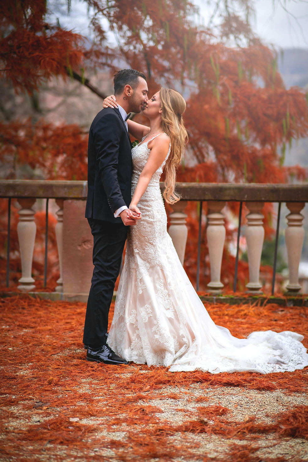
Autumn weddings have a quality that no other season can manufacture: genuine atmosphere. The light is warmer and more golden, arriving at a lower angle that transforms everything it touches. The colours are richer. The evenings arrive earlier, extending the candlelit portion of the day. And the overall feeling — when embraced rather than fought — is one of enveloping intimacy.
Where spring offers softness and summer offers abundance, autumn offers weight. There is a richness to everything in this season, and wedding design that leans into this quality rather than resisting it produces some of the most visually powerful results of any time of year.
The temptation in autumn is to lean entirely on the expected — the obvious rustic references, the predictable palette of orange and brown. The most sophisticated autumn weddings resist this and find the season's real poetry in restraint: tonal richness applied with discipline, dramatic florals used with purpose, candlelight allowed to do its quiet work without being supplemented by excess.
For stationery, autumn is the most generous season in the calendar. Heavier stocks feel not just appropriate but essential. Deeper inks are not just permitted — they are invited. Finishes such as copper foiling, wax seals, and velvet ribbon find their most natural home here, where the tactile dimension of paper design matters most.
COLOUR PALETTES
BURNT EARTH —
CLASSIC
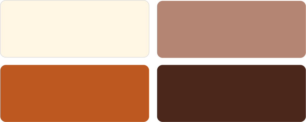
Espresso, rust, mocha, cream. Grounded, warm, and deeply inviting. The most reliably beautiful of all autumn palettes — perpetually relevant because it is drawn directly from the season itself, and photographs with extraordinary warmth.
DARK ROMANCE —
CLASSIC

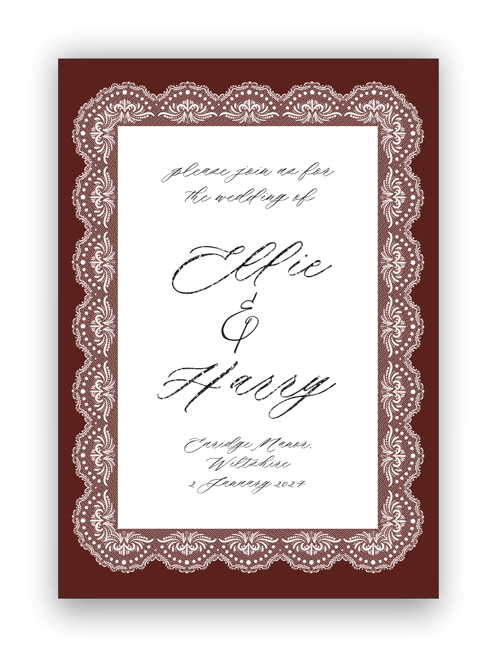
Burgundy, plum, black, soft blush. Dramatic, refined, and quietly opulent. The single note of blush prevents the palette from reading as heavy — a careful balance that holds the whole combination in tension.
SOUR FIG —
2026 TREND
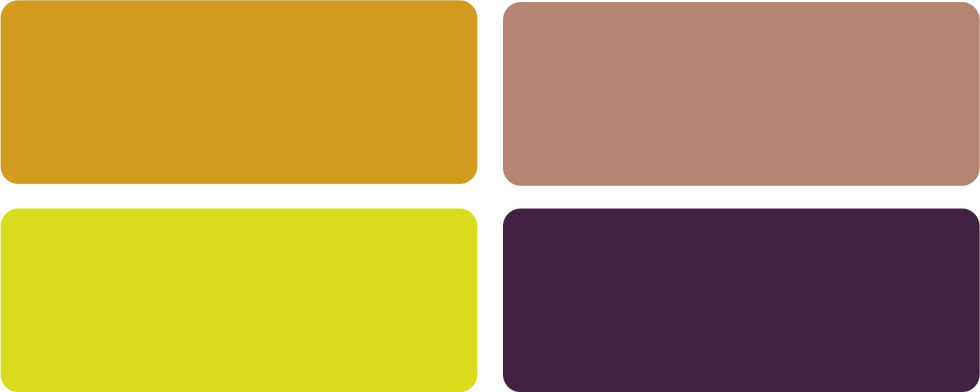
Deep fig, chartreuse, mocha, antique gold. The most talked-about autumn colour story of 2026 — bold, directional, and editorial-led. The combination of deep purple-red with acid green is daring but extraordinarily beautiful when executed with care.
AUTUMN FLORALS
Depth, Texture, Movement
Autumn florals should feel layered and intentional, with a focus on tonal richness rather than colour variety. This is less about softness, more about presence — each stem chosen for what it adds to the overall composition rather than how it reads in isolation.
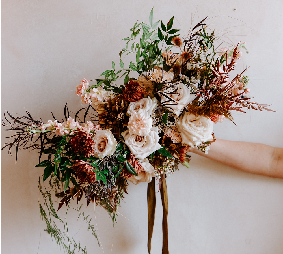 | Deep Dahlias Tonal richness | Chrysanthemums Structure & presence |
Toffee Roses Warmth & romance | Scabiosa Pods Sculptural texture | |
Amaranthus Trailing movement | Smoke Bush & Oak Seasonal foliage depth |
AESTHETIC DIRECTIONS
Three Ways to Design an Autumn Wedding
Autumn accommodates the widest tonal range of any season — from deeply dramatic to warmly organic. These three directions represent the most distinctive approaches to an autumn celebration in 2026.
WUTHERING HEIGHTS ROMANCE
A stormy, romantic interpretation of the English landscape — untamed, textural, and quietly dramatic. Windswept florals, washed linens, raw edges, stone and earth-led backdrops. Movement everywhere: ribbons, veils, grasses. Heather, stone, charcoal, faded plum, soft ivory. Paired with the Grange Suite — soft structure and textured stocks that ground the wildness with refinement.
GILDED BAROQUE
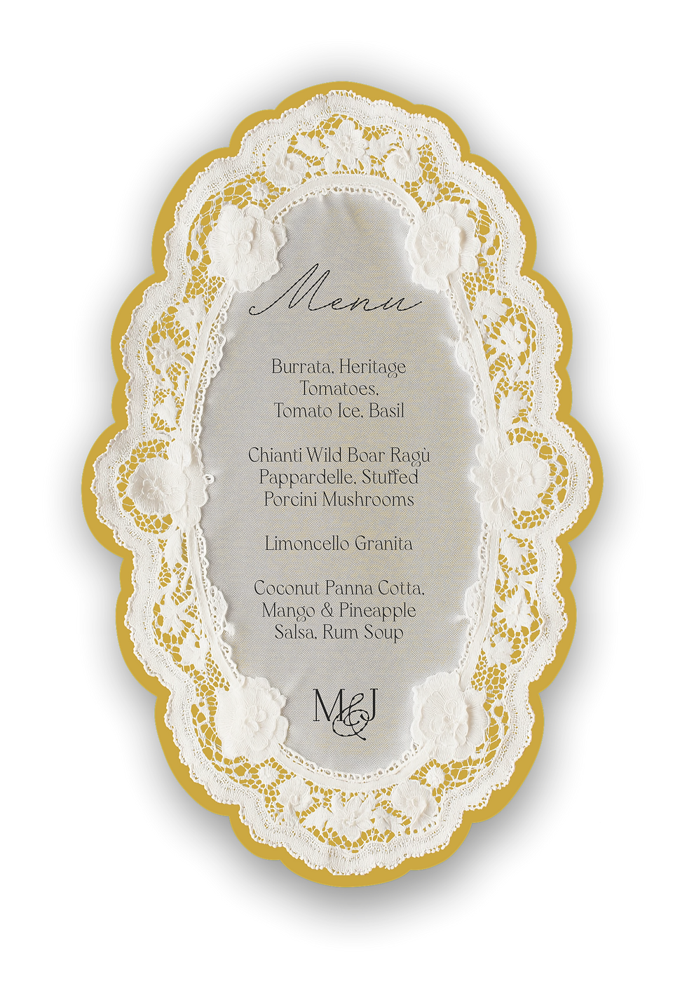
Opulence, drama, and European grandeur interpreted through a modern, restrained lens. Ornate detailing with space and discipline. Sculptural florals in deep red and cream, candlelight, architectural symmetry, antique gold used intentionally rather than abundantly. Antique gold, oxblood, blackened plum, ivory, deep espresso. Paired with the Opera Suite (coming soon) — gold shimmer, heavier stocks, and statement typography designed for exactly this world.
MODERN PRAIRIE
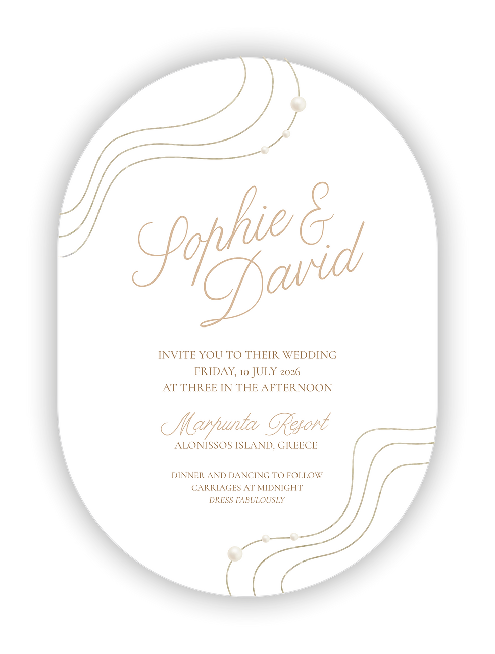
A refined, open-air aesthetic inspired by wide landscapes, natural textures, and understated warmth. Long tables, expansive open settings, dried grasses, tonal arrangements, ceramic and linen details used sparingly. Clean styling — never cluttered, never rustic in the expected sense. Sand, wheat, terracotta, sun-faded rose, warm neutrals. Paired with the Cove Suite for pure minimalism or the Palazzo Suite for a more elevated register.
Autumn is where stationery becomes tactile storytelling. Heavier stocks, deeper inks, richer finishes — every element contributes to the overall sensory experience. This is where design moves beyond visual and becomes something you can almost feel.
SACRED INK · THE AUTUMN PERSPECTIVE
Find Your Autumn Suite
Each Autumn aesthetic has a stationery suite designed specifically for it —
the right paper, palette, and finish for the day you are imagining.

Comments